Introduction
Have you ever been reading an article online when suddenly the content jumps around because an image or ad loads in? That jarring experience is caused by Cumulative Layout Shift, or CLS.
Here's a breakdown of what CLS is and why it matters:
What is CLS?
Imagine a web page as a newspaper layout. Ideally, everything should stay in its place once the page loads completely.
CLS (Cumulative Layout Shift) is a metric that measures the total amount of visual instability experienced by a user within the first 5 critical seconds of page load.[1]
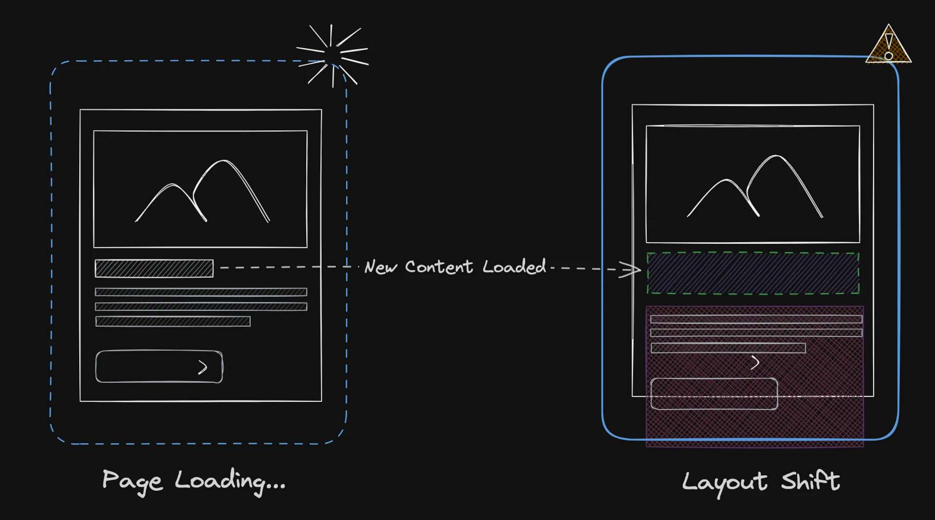
This score helps us understand how often and how severely elements jump around on the screen during the initial page load.
CLS can happen due to various reasons:
Instability Sources
- Images without dimensions:
- If an image doesn't have its width and height specified, the browser has to guess its size while loading. This can cause other elements to move around to accommodate the image's final size.
- Dynamic Content:
- For example, ads. Ads are often loaded dynamically, meaning their size and placement can change as the page loads. This can cause content below the ad to jump around.
- Web Fonts:
- Sometimes, fonts take a while to load. If text content uses a font that isn't yet available, the browser might reserve a generic space for it, causing a layout shift when the actual font loads.
Impact on UX
Overview
CLS isn't just an annoyance; it can significantly impact UX in a few ways:
- Disruption:
- Unexpected layout shifts can disrupt your focus while reading or interacting with a page. Imagine trying to click a button, but the layout shifts and you end up clicking something else entirely.
- Frustration:
- These jumps can be frustrating, especially if they happen repeatedly.
- Reduced Trust:
- A website with frequent layout shifts might appear unprofessional or poorly maintained, leading users to lose trust in the content.
- SEO:
- CLS is actually a Core Web Vital, a set of metrics that Google uses to measure website performance.
- High CLS scores can negatively impact your search ranking, making it harder for users to find your website.
The Bottom Line
Preventing CLS is crucial for a smooth and enjoyable user experience. By implementing best practices (like specifying element dimensions and using placeholders), you can ensure your webpage stays put, keeping your visitors happy and search engines satisfied.
Avoid Cheating
While it's technically possible to cheat the CLS score by focusing on the first 5 seconds, it's not a recommended approach. A good website prioritizes user experience, not just a specific metric.
The focus should be on creating a website that delivers a consistently smooth and performant experience for users throughout their interaction.
Key Takeaway:
By implementing best practices for layout shift mitigation, you can achieve a good CLS score naturally and create a user-friendly website.
Web Rendering: SSR vs SPA
The method used to initially render a webpage can influence its vulnerability to layout shifts. For context, let's briefly examine the two primary architectural strategies, though this won't serve as a comprehensive guide on the nuances of SSR and SPA.
For a more comprehensive exploration of these technologies, consider checking out this article on web rendering.
SSR: Server Renders
In SSR, the initial HTML content is generated on the server, including the necessary data to display the page:
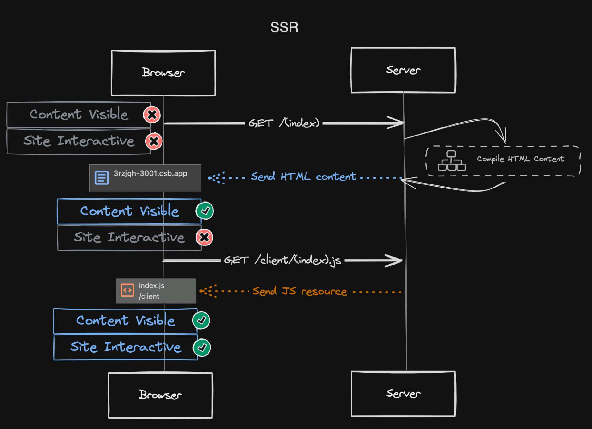
Server-side rendering (SSR) shines in its ability to deliver a more performant user experience. Here's how:
- Faster Initial Load and FCP:
- By pre-rendering the initial HTML content on the server, SSR ensures the browser receives the necessary data to display the page quickly.
- This translates to a faster initial load time and a quicker First Contentful Paint (FCP), the time it takes for users to see the first bit of actual content on the screen.
- Reduced Layout Shifts:
- Since the initial content is already prepared on the server, there's less chance of unexpected layout shifts that can occur during dynamic loading in client-side rendering. This results in a smoother scrolling experience for users.
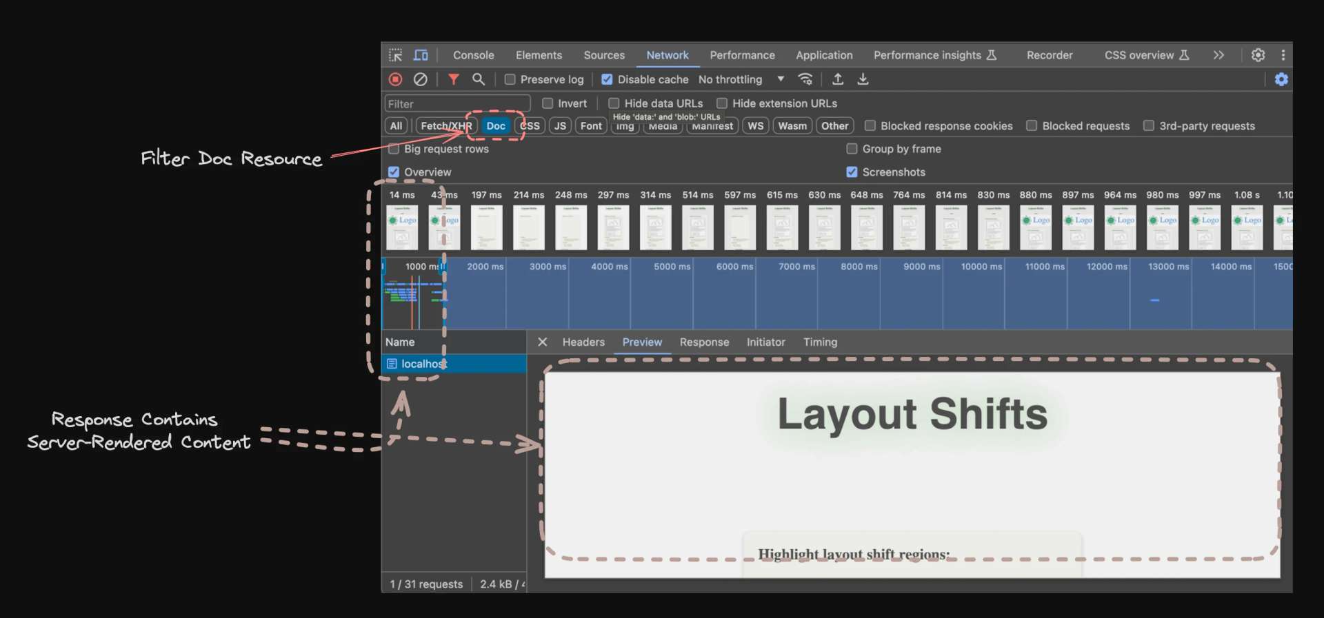
To observe this in action, open your browser's developer tools (shortcut: Command + Shift + I), navigate to the 'Network' tab, and filter resources by 'Doc'.
If you are following using the sandbox project, make sure
ssris set totruein/server/args.ts. Set tofalseto render as SPA in the next section.
SPAs: Single Page
SPAs rely heavily on JavaScript to dynamically render content within a single HTML document. While SPAs offer a smooth user experience after the initial load, the dynamic nature of content updates can introduce layout shifts if not managed carefully. Please note this diagram doesn't represent the "order" of network requests. With HTTP/2, the browser can request the HTML document and JavaScript resources concurrently. This is due to a feature of HTTP/2 known as multiplexing. See HTTP/2 RFC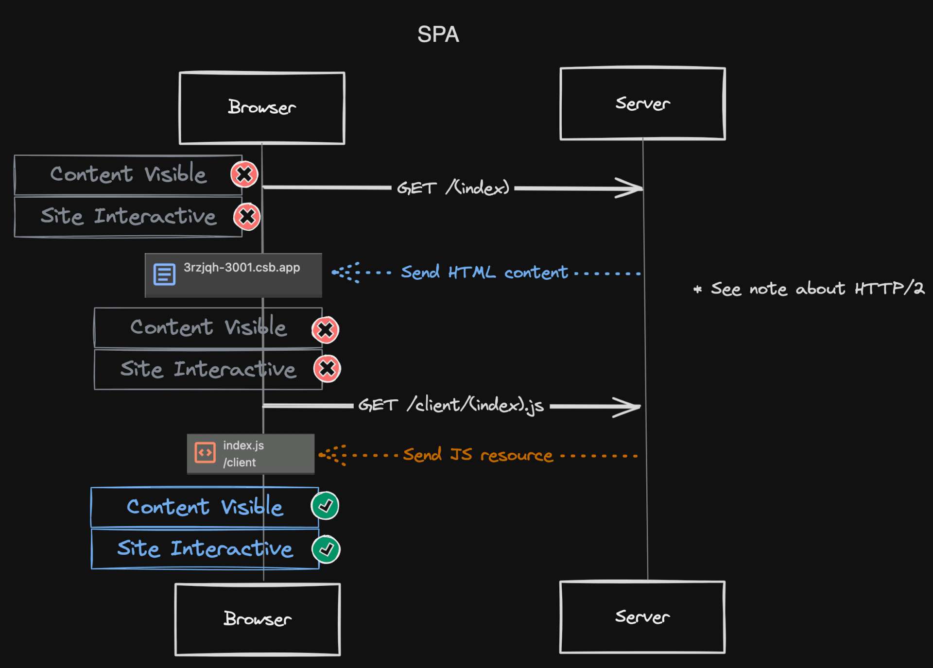
While SPAs do handle logic, data fetching, templating, and routing on the client-side, they don't necessarily require more data to be sent initially compared to SSR.
In fact, SPAs can sometimes be optimized to send less data upfront by only fetching essential information for the initial render.
SPA Characteristics
An SPA is still characterized by the following key features:
- Single-Page Application:
- It loads a single HTML page initially and relies on JavaScript for subsequent content updates.
- Client-Side Rendering:
- The main logic, data fetching, templating, and routing are handled by JavaScript on the client (user's device) after the initial load.
- Dynamic Content:
- Content is updated dynamically without full page reloads, creating a seamless user experience.
We can observe these characteristics when rendering our React as SPA from the Network tab:
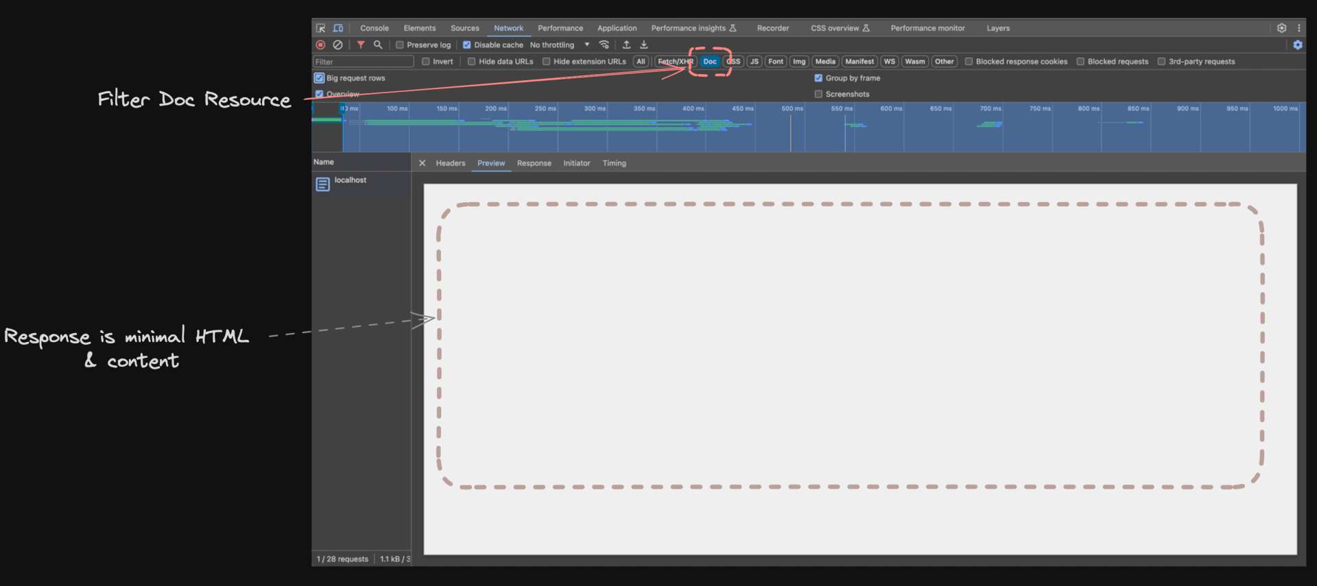
Here is the markup from the response:GET / 200 Response Doc<!DOCTYPE html>
<html lang="en">
<head>
<script type="module">
import RefreshRuntime from "/@react-refresh"
RefreshRuntime.injectIntoGlobalHook(window)
window.$RefreshReg$ = () => {}
window.$RefreshSig$ = () => (type) => type
window.__vite_plugin_react_preamble_installed__ = true
</script>
<script type="module" src="/@vite/client"></script>
<meta charset="UTF-8" />
<!-- <link rel="icon" type="image/svg+xml" href="/vite.svg" /> -->
<!-- Meta tags excluded from code snippet -->
<title>SSR vs SPA Layout Shift Demo</title>
<link
rel="preload"
href="/client/assets/fonts/PoetsenOne-Regular.ttf"
as="font"
type="font/ttf"
crossorigin=""
/>
<style>
html,
body {
margin: 0;
padding: 0;
}
</style>
<script>
window.__INITIAL_STATE__ = "<!--ssr-state-->";
</script>
</head>
<body>
<!-- React will mount to #root element when using single page rendering -->
<div id="root"></div>
<script type="module" src="/client/main.tsx"></script>
</body>
</html>
Data and Layout Shifts in SPAs
The bigger concern for layout shifts in SPAs comes from the dynamic nature of content updates. Since the entire page isn't pre-rendered on the server, elements might shift around as the browser receives and processes new data to update the page dynamically.
- Drawbacks:
- As new data is fetched and content updates dynamically, elements might resize or reposition themselves, causing the layout to jump around. This can be frustrating for users.
- Benefits (Potential):
- While SPAs are susceptible to layout shifts, they also offer some flexibility for mitigation strategies.
- Techniques like lazy loading and using Intersection Observer can help ensure element sizes are known before updates, reducing layout shift occurrences.
Interested in learning more? Check out my previous article on the use of Intersection Observer API with practical examples.
Summary
- The amount of data passed to the user's device isn't the main factor influencing layout shifts in SPAs.
- The dynamic updates and potential for elements to resize during rendering are more relevant concerns.
- However, SPAs do offer some potential benefits for layout shift mitigation with techniques like lazy loading and fine-grained control over rendering.
Upcoming
Now that we've delved into the layout shift culprits in both SSR and SPA applications, it's time to switch gears and put some theory into practice!
To illustrate these strategies effectively, we'll be focusing on our sample project throughout separate articles. This will allow for a deeper dive into each technique, providing clear, step-by-step guidance.