Setting the Stage
This document delves into various strategies for rendering images while maintaining optimal browser performance. It emphasizes web performance practices that reduce layout shifts to develop stable and user-friendly web pages.
Above the Fold
On a webpage, the content above the fold refers to everything users see immediately upon loading, without needing to scroll down.
These are the first visuals and information that grab their attention. Imagine a newspaper.
The top section you see when it's folded in half is what readers encounter first. In the world of web development, this concept translates to the content users see on a webpage without scrolling down.
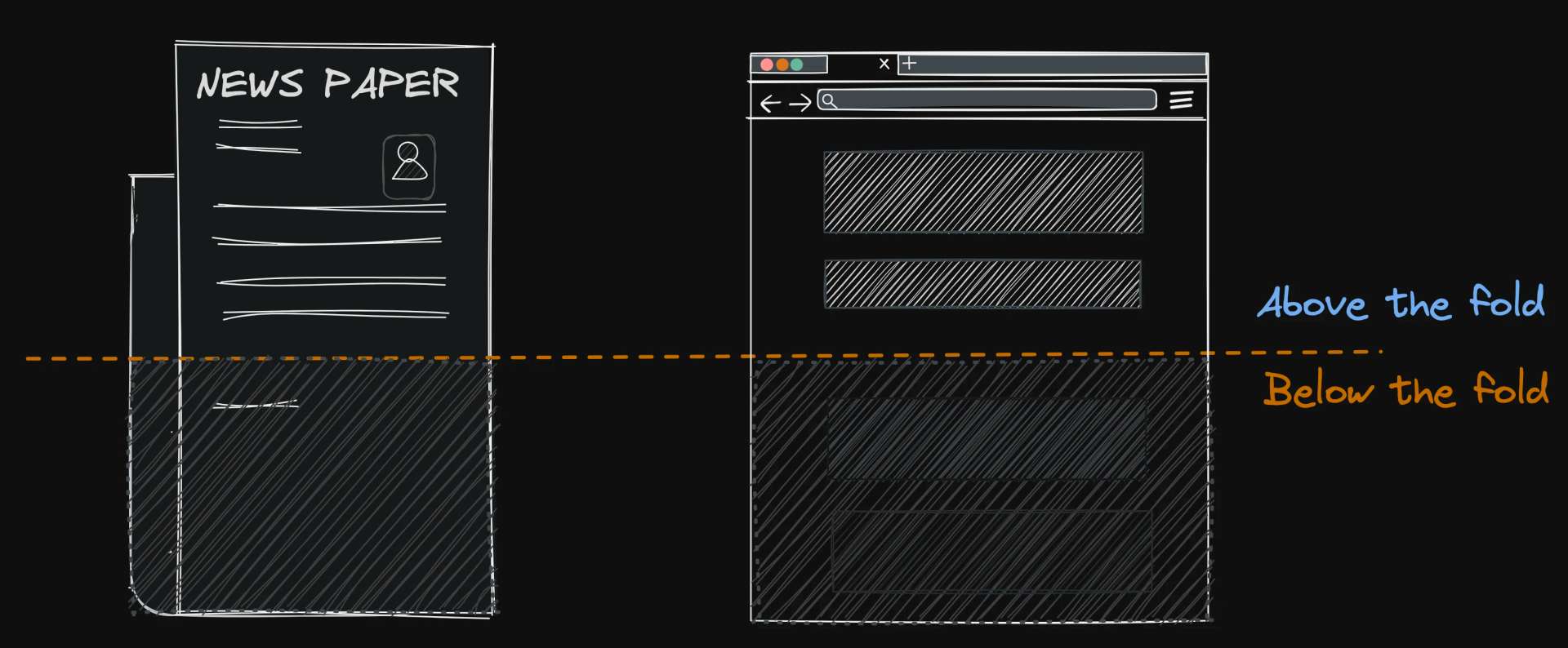
We call this the "above the fold" content. These initial visuals and information play a crucial role in grabbing attention and setting the stage for the rest of the page.
Suggested Reading
- "Prioritize Visible Content" (Google PageSpeedInsights)
- "Above the fold". (Wikipedia)
Relevance to CLS
The concept of "above the fold" is directly connected to layout shift because it highlights the criticality of image loading for the initial content users see without scrolling.
Key Takeaways
- Images in the "above the fold" area are especially important to load quickly and consistently to prevent layout shifts.
- Slow loading or unexpected image dimensions can cause the browser to adjust the layout as images appear, disrupting the initial content users see.
- Since "above the fold" content sets the first impression, layout shifts in this area are particularly detrimental to user experience.
Think of it like this:
Just like a well-prepared newspaper provides a smooth reading experience, web development ensures a seamless user journey. Without the careful work of web developers, users might encounter scattered information (text and blurry images) that jumps around as it loads, making it difficult to understand.
Measurements
Here are some of the measurements performance tools such as WebPageTest.org uses to determine site performance relevant to images:
- Largest Contentful Paint time was under 2.5 seconds
- Zero render-critical images are lazy-loaded.
- Zero images outside the critical viewport need to be lazy-loaded.
In the next sections, we'll delve deeper into the different image loading scenarios that can cause layout shift, both in Single Page Applications (SPAs) and Server-Side Rendered (SSR) applications.
We'll explore how to identify and address these issues to ensure your website delivers optimal user experience from the very first click.
Img Attributes
In this section, we will develop an understanding of how the browser interprets image element attributes and downloads images. This knowledge is important to effectively mitigating layout shifts, a factor Chrome measures through its new CLS metric.
Suggested Reading
For more details on how images work in HTML, you can check out the official documentation. WHATWG provides a comprehensive look at the technical aspects. while MDN offers a user-friendly guide to the
<img>element.
Attribute Timing
When a browser processes images on a web page, it follows a specific sequence of steps. Here's a simplified look at this process:
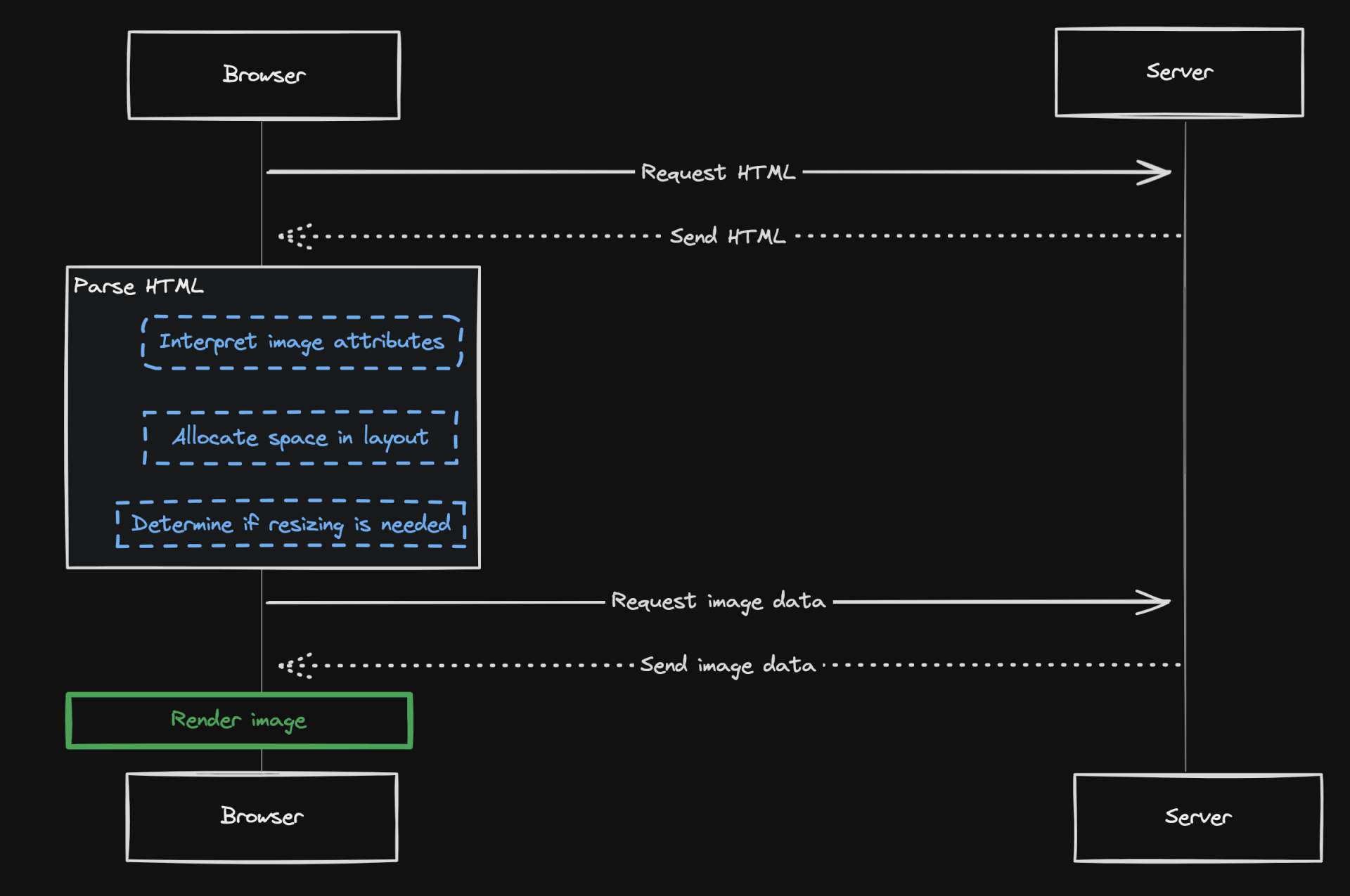
- Early Interpretation
- The browser first interprets the image attributes before downloading the image itself.
- This early interpretation allows the browser to:
- Allocate space in the layout for the image, thereby preventing unexpected layout shifts when the image loads.
- Determine if resizing is needed based on the defined dimensions.
- Download Later
- The actual download of the image data typically happens asynchronously after the initial parsing.
- This approach helps keep the page loading process smoother.
- The actual download of the image data typically happens asynchronously after the initial parsing.
Layout Shift Impact
Now, let's explore how these steps impact the performance of a markup containing an image and a card component in React, specifically comparing scenarios where we use width and height attributes versus when we don't.
Missing width and/or height
In some cases, you may find images treated like regular elements within a flexbox or CSS grid layout.
While this might achieve the desired page layout, it can negatively impact performance and cause layout shifts, as the space for the image isn't pre-allocated.
This approach can lead to layout shifts because the space isn't reserved for the image in advance.
Consider the following example: <div style={{ display: 'flex' }}>
<img src="https://picsum.photos/250" alt="Random image" />
<Card />
</div>
In this case, the image's rendering causes a layout shift because the browser doesn't have enough information to allocate space for the image before it loads:
In this example I have Layout Shift Regions enabled in devtools to indicate areas causing layout shift.
What's happening here is when the browser encounters a Flexbox or Grid container in the HTML, it interprets the layout rules defined in the CSS.
Once the image is downloaded and its intrinsic dimensions (original width and height) are known, the browser might need to adjust the layout to accommodate the actual image size.
This adjustment can cause a slight jump in the surrounding content's position, creating a layout shift as we can observe here.
When used in conjunction with
widthandheightattributes, Flexbox and CSS Grid layout are effective in markup that doesn't cause layout shift. We'll delve deeper into this in a subsequent section.Be proficient with them!
With width and height
Now let's make a comparison against an image element where width and height are defined.
Consider the following:<div style={{ display: "flex" }}>
<img
src="https://picsum.photos/250"
alt="Random image"
width="250"
height="250"
/>
<Card />
</div>
With this change, the appropriate amount of space is reserved for the image in advance, preventing any abrupt shift of the text when the image is downloaded:
In both SPAs and SSR applications, images are typically downloaded asynchronously. Setting width and height on image tags provides a clear expected size for the image, reducing the chance of layout adjustments.
Strategy #1
Your first strategy to mitigate layout shift for images is to make use ofwidthandheightattributes.
Performance Implications
Below is a comparison between the two performance timings for the previous two examples:
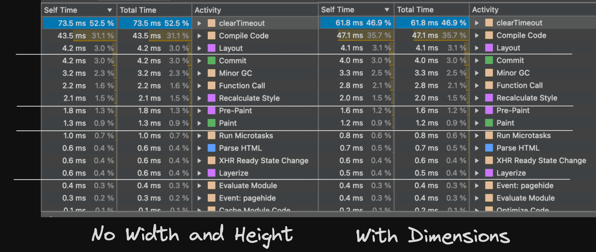
On the left are performance metrics without image dimensions, and on the right, with dimensions. To interpret the performance data, take into account these measured metrics:
Layout- The browser's time to calculate page layout, including element positioning and sizing. Changes in image width and height can significantly affect this.
Paint- The time taken to render pixels on the screen, influenced by image complexity such as size, resolution, and format.
Recalculate Style- The overhead added to the rendering process when image attributes change dynamically via JavaScript, causing the browser to recalculate styles.
We can observe the impact excluding width and height can negatively affect performance, especially on 3G networks.
Intrinsic Dimensions
Let's delve into another common challenge that arises when image dimensions are not specified.
This issue often surfaces when the intrinsic dimensions of images cause them to overflow their container boundaries. This overflow then prompts unnecessary layout styles to reposition and resize surrounding elements to accommodate the larger images.
Consider the following React snippet where we aim to fit an image, originally 300px wide, into a square container with explicitly defined width and height, instead of setting these dimensions on the image element itself:<ContentContainer>
<div style={{ width: '250px', height: '250px' }}>
<img src="https://picsum.photos/300" alt="Random image" />
</div>
</ContentContainer>
However, the image overflows the container as shown here below:
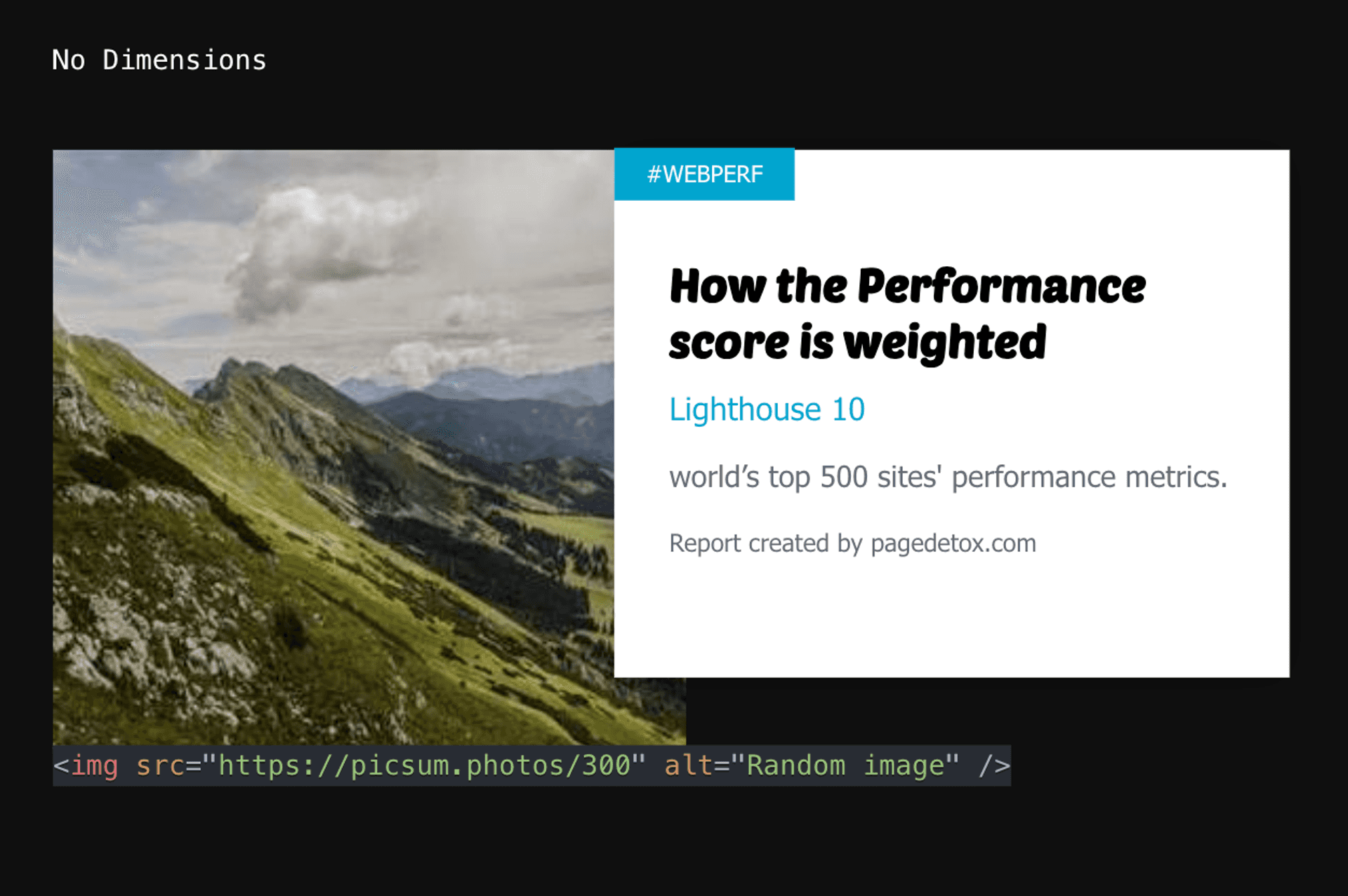
This happens because images are considered replacement elements and have an instristic size (their original width and height).
And by default, browsers aim to display images at their intrinsic dimensions unless instructed otherwise using CSS properties like width and height.
In this case, the image's intrinsic width of 300px exceeds the container's 250px width, causing the overflow.
When the browser encounters this code compiled from our React snippet:<div style="width:250px;height:250px;">
<img src="https://picsum.photos/300" alt="Random image" />
</div>
- It parses the HTML and understands the structure of the container and image.
- It reads the CSS styles for the container and image.
What about background-image?
You might consider using background-image to display an image within a container. While this is possible, it's typically not the preferred method for such a scenario.
Using background-image offers limited control over image positioning and omits the use of alt attributes, which are crucial for enhancing accessibility for users.
Just like before, this problem can be mitigated by setting width and height attributes on the image element:<ContentContainer>
<div style={{ width: "250px", height: "250px" }}>
<img
src="https://picsum.photos/300"
alt="Random image"
width="250"
height="250"
/>
</div>
</ContentContainer>
Just like before, specifying the image dimensions, you ensure that the image fits within its container, preventing overflow and improving the stability of your layout.
Nuanced Theory
The width and height attributes function similarly in both Single Page Applications (SPAs) and Server-Side Rendered (SSR) applications.
However, it's important to note that there are subtle distinctions in each scenario. Understanding these nuances provides a more comprehensive and holistic grasp of the subject:
Fundamental Role
In both SPAs and SSR applications, the width and height attributes on the <img> element define the intended dimensions for the image within the layout. The browser uses these dimensions to allocate appropriate space for the image, preventing other elements from shifting unexpectedly when the image loads.
Variations in Rendering Approaches
| Rendering Type | Description |
|---|---|
| SPA (Single Page Applications) | In SPAs, the initial HTML structure is sent to the browser, but image data is usually fetched dynamically using JavaScript. By setting the width and height attributes, the browser can reserve space for the image while it's being downloaded, thus preventing layout shifts. |
| SSR (Server-Side Rendering) | In SSR, the initial HTML response from the server may include data URIs for small images or references to image sources. Set the width and height attributes to prevent layout shifts based on the image's intrinsic dimensions (its native size), especially when data URIs are not used. |
To summarize, in SPAs, these attributes help reserve space for dynamically loaded images. In SSR, they ensure proper sizing based on intended dimensions, especially when not using data URIs.
Image Sizing & Scaling
In the following sections, we'll build some understanding about how browsers handle aspect ratio and scaling. This will help us get why the solutions in the following section are set up the way they are.
Image Aspect Ratio
For a more detailed explanation, refer to Barry Pollard's post.
When dealing with images, especially those with dynamic sizes, it's beneficial understand the relationship between width, height, and image aspect-ratio.
Let's consider a scenario where we have an image with dimensions of 450x100, but these dimensions are unknown to us until the image is fetched.
We want to render this image in an img element with dimensions defined to width="100" and height="100":<div>
<img
src="https://picsum.photos/450/100"
alt="Random image"
width="100"
height="100"
/>
</div>
Scaling and Distortion
When the aspect ratio of the original image differs from the aspect ratio defined by the width and height attributes, the browser has to make a decision on how to display the image. Recall that the browser's goal is to prevent distortion and maintain the visual integrity of the image.
In our case, where both width and height are set to 100, the image will be displayed within a 100x100 space, regardless of its original dimensions. However, the aspect ratio of the original image will affect how the image is displayed within that 100x100 space.
There are two scenarios in which our image's intrinsic dimensions will be displayed
- Square Dimensions
- If the original image's width and height are equal (forming a square), the image will be proportional to the edges within the
100x100space, maintaining its original1:1aspect ratio.
- If the original image's width and height are equal (forming a square), the image will be proportional to the edges within the
- Non-Square Dimensions
- If the original image's width and height are not equal (not forming a square), the image will be scaled to fit the
100x100space. Depending on the CSS properties set for the image (likeobject-fit), this could lead to distortion or parts of the image being cropped out, as the browser tries to maintain the original aspect ratio.
- If the original image's width and height are not equal (not forming a square), the image will be scaled to fit the
User-Agent Stylesheets
Now let's address the second challenge we face.
Different browsers handle image aspect ratios in unique ways. For example, Chrome, clips images to fit within the defined dimensions, potentially cropping parts of non-square images with this CSS:// Chromium styles
video, canvas, img {
overflow: clip;
overflow-clip-margin: content-box;
}
Source: Chromium GitHub
Other browsers may preserve the entire image by adding bars (letterboxing or pillarboxing), which can leave empty space in the defined area:
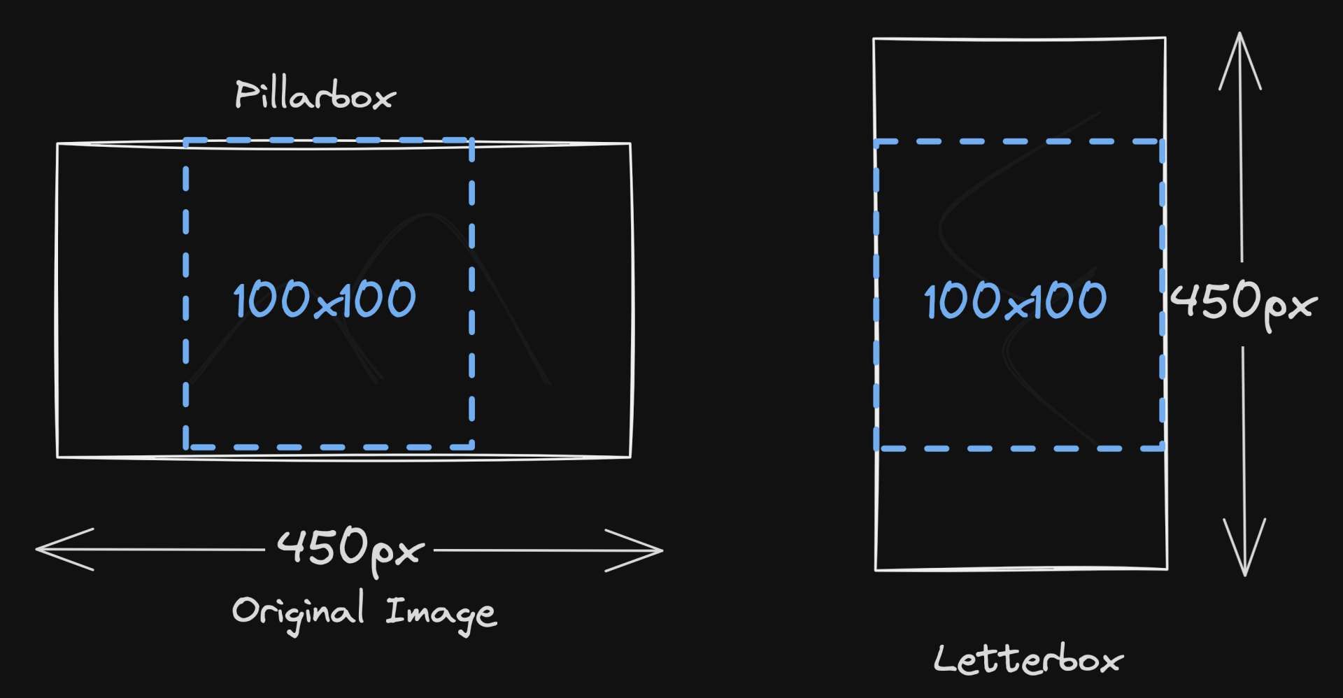
Be aware of these behaviors working with images of different dimensions and aspect ratios!
Aspect-Ratio Experiment
To better understand how browsers handle image aspect ratios, we'll conduct an experiment with the following requirements:
Aspect-Ratio Experiment Requirements
Masonry Grid: Create a masonry grid of images with different dimensions. Each image's
widthandheightshould be set to100.External Images: Use images from external URLs, not data URIs.
| Image URL | Width | Height |
|---|---|---|
| https://picsum.photos/450/100 | 450 | 100 |
| https://picsum.photos/300/300 | 300 | 300 |
| https://picsum.photos/50/250 | 50 | 250 |
| https://picsum.photos/250/50 | 250 | 50 |
| https://picsum.photos/150/200 | 150 | 200 |
| https://picsum.photos/350/100 | 350 | 100 |
- Observe Dimensions: Be able to observe the original image dimensions and compare them to the rendered dimensions.
Rendering Approach
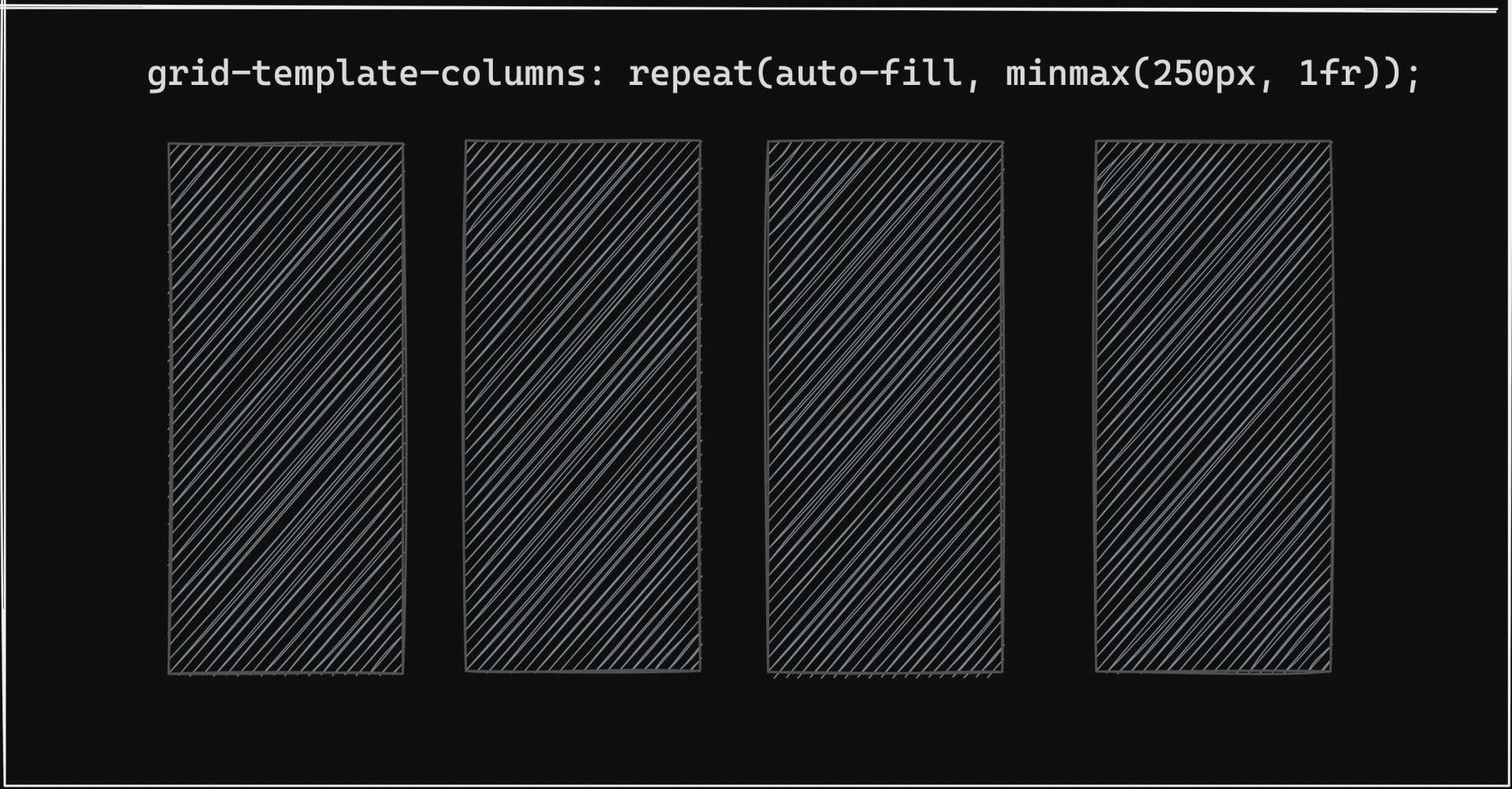
We'll iterate over an array of images and use CSS Grid's auto-fill property to dynamically create as many columns as can fit within our container.
Each column will have a minimum width of 250px and can grow equally to fill any remaining space after the minimum width is met. This approach ensures a flexible and responsive layout.const images = [
"https://picsum.photos/450/100",
"https://picsum.photos/300/300",
"https://picsum.photos/50/250",
"https://picsum.photos/250/50",
"https://picsum.photos/150/200",
"https://picsum.photos/350/100",
];
/* styled-components implementation */
const Grid = styled.div`
display: grid;
grid-template-columns: repeat(auto-fill, minmax(250px, 1fr));
grid-template-columns: 1fr;
grid-auto-rows: 1fr;
gap: 2rem;
grid-auto-flow: dense;
height: 800px;
width: 1000px;
`;
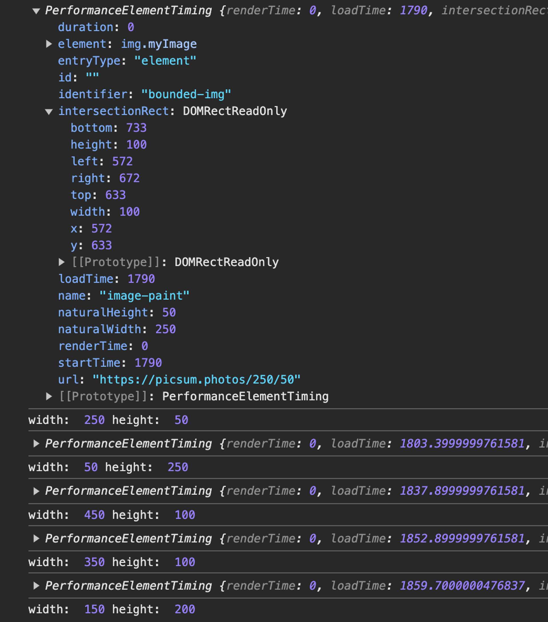
To observe aspect ratio of the original image, we can use Performance Observer API.
Here's the React/Typescript(TSX) component we've created for our experiment:React component code snippet
import { useEffect, useId } from 'react';
import { Grid } from './Grid';
type ImageProps = {
images: string[];
};
const MasonryLayoutComponent: React.FC<ImageProps> = ({ images }) => {
useEffect(() => {
const observer = new PerformanceObserver((list) => {
list.getEntries().forEach((entry) => {
console.log(entry);
});
});
observer.observe({ type: "element", buffered: true });
}, []);
return (
<Grid>
{images.map((img) => {
const [w, h] = img.split("photos/")[1].split("/");
return (
<div
key={useId()}
style={{ display: "flex", flexDirection: "column" }}
>
<p>
w: {w} x h: {h}
</p>
<img
elementtiming="bounded-img"
className="myImage"
height="100"
width="100"
src={img}
alt="Your image description"
/>
</div>
);
})}
</Grid>
);
};
export default MasonryLayoutComponent;
This is how the component renders:
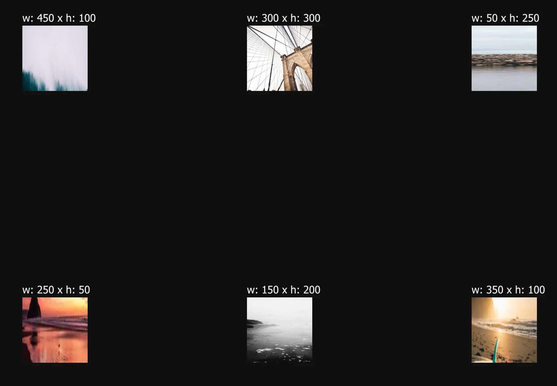
width and height set to 100
The image appears distorted because the browser is attempting to confine it within a 100x100px space, consistent with the browser's automatic scaling behavior, which aims to preserve the original aspect ratio of the image to avoid distortion.
The output from PerformanceObserver provides us with the original dimensions of the image, represented by naturalWidth and naturalHeight.
The distortion occurs in Chrome, due to the default overflow: clip; style for images, setting a specific size (like 100x100px) might clip the image to fit those exact dimensions, regardless of the original aspect ratio. However, this implementation successfully prevents any layout shifts :D.
Understanding aspect-ratio for Images
When inspecting an image element in the developer tools, you might notice a property like aspect-ratio: auto 100 / 100. This comes from the width and height attributes we defined on the image element.
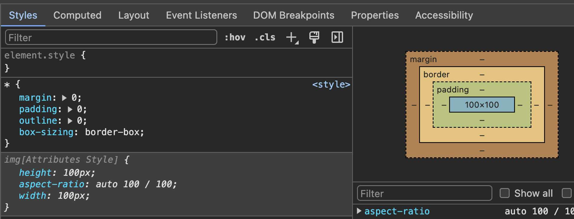
aspect-ratio property in developer tools when both width and height of an image are explicitly set to 100px.
- Breaking this down:
- The
aspect-ratioproperty allows you to specify an element's aspect ratio, but it doesn't directly influence browser scaling, which is typically based on the image's original dimensions and available layout space. - The
autovalue inaspect-ratioserves as a fallback, not a directive to maintain the original ratio. - The
100 / 100value signifies a1:1aspect ratio.
- The
Browser Default Image Scaling Behavior
What happens if we didn't set width and height attributes on the image? Let's update our image element markup: <img
elementtiming="bounded-img"
height="100"
width="100"
alt="Your image description"
src="..."
/>
Images that lack width and height attributes are displayed based on their original intrinsic dimensions as shown below:
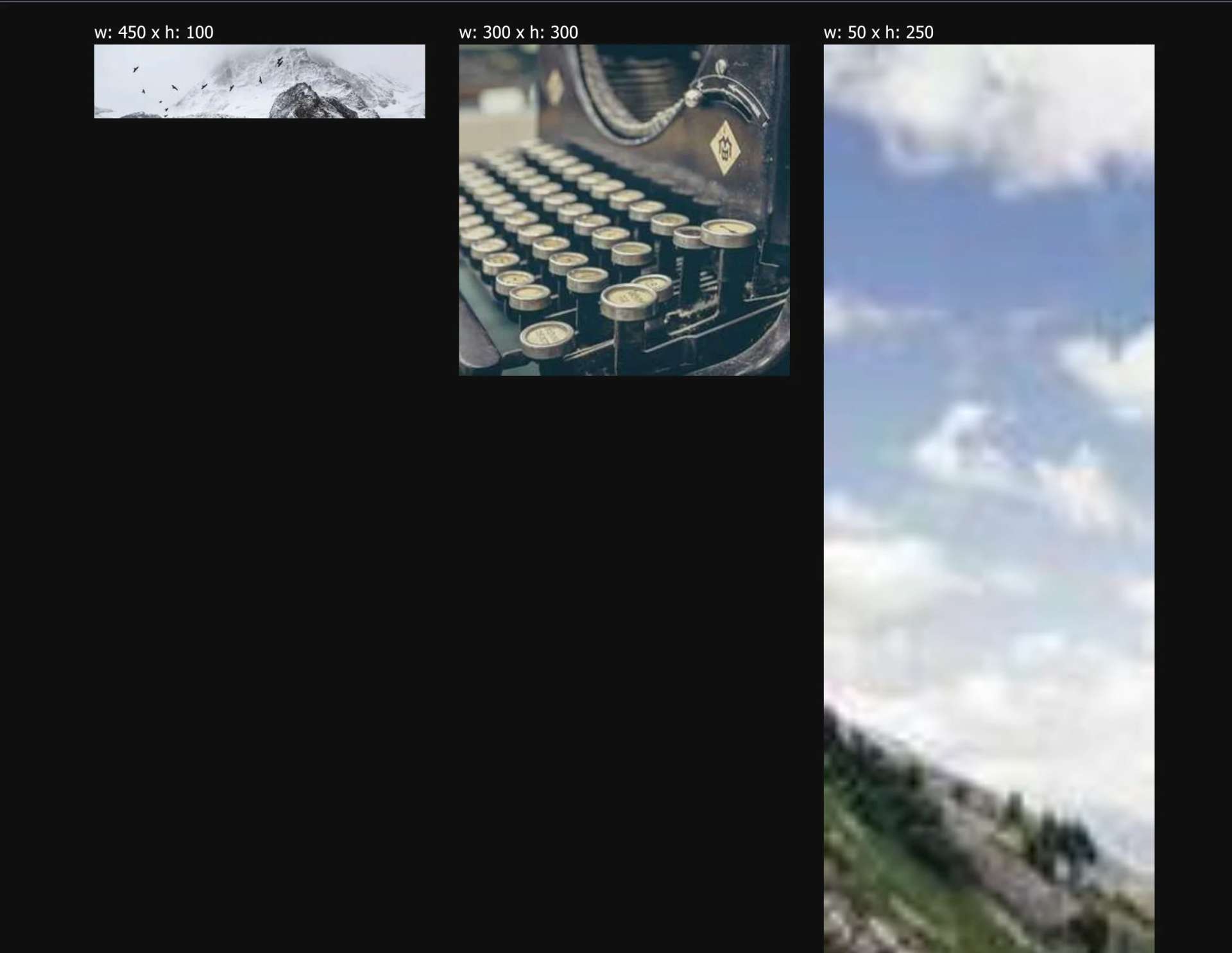
What is happening here is without width and height, the browser preserves the original aspect ratio of the image when rendering.
In this scenario, while the images were confined by our grid layout, the heights of the images were rendered to optimally fit the calculated width. This resulted in the subsequent row of images being displaced downwards causing layout shift.
Scaling Factor Analysis
For completion, let's validate these assertions about the browser's scaling behavior for images. We'll examine more closely an image with intrinsic dimensions of 50x250.
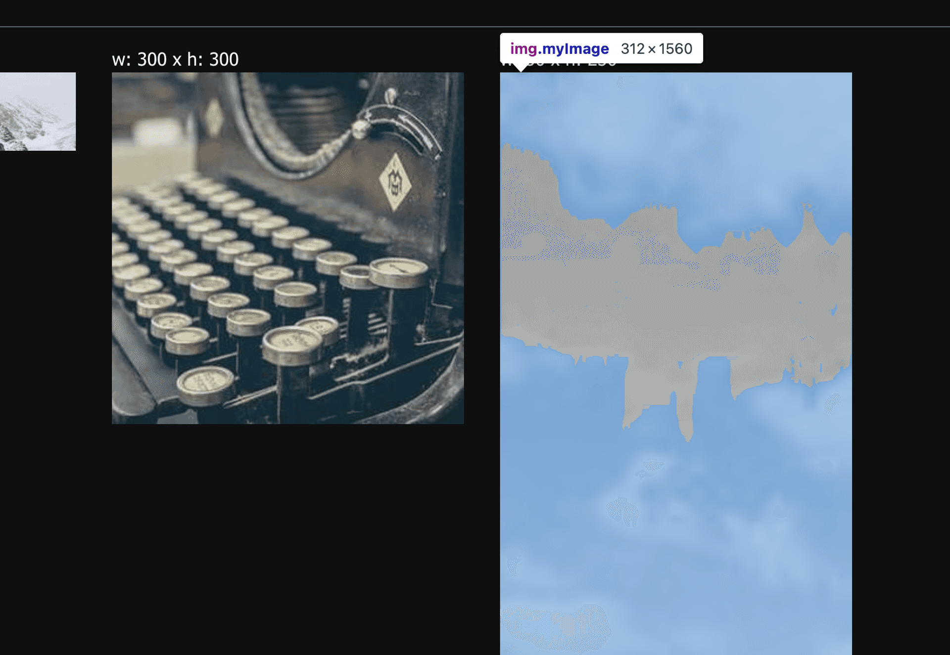
50x250 is preserved in the rendered image dimensions of 312x1560.
Here, note how the browser confines the image width to 312px, as dictated by the grid layout container:.grid {
/* ... */
grid-template-columns: repeat(auto-fill, minmax(250px, 1fr));
}
The aspect ratio of an image is the ratio of its width to its height. It's usually written as two numbers separated by a colon:width to height -> (w:h)
Portrait-style image might have ratio 2:3
-> 500px × 750px, 1500px × 2250px, etc
For the original image:
width:50pxheight:250px
So, the aspect ratio of the original image is 50:250, which simplifies to 1:5.
For the rendered image:
width:312pxheight:1560px
So, the aspect ratio of the rendered image is 312:1560, which simplifies to 1:5.
| Image | Width | Height | Aspect Ratio |
|---|---|---|---|
| Original | 50px | 250px | 1:5 |
| Rendered | 312px | 1560px | 1:5 |
Leveraging CSS Specificity
In practice, images often have multiple styles applied through CSS. Besides setting width and height image attributes, you can also control image dimensions from CSS. To use this effectively and prevent layout shift, it's crucial to understand how CSS specificity interacts with these attributes.
When used correctly with image attributes, CSS can be a more refined tool for image sizing and aspect ratio management.
Consider the following example where an image has defined width and height attributes:<img src="image.jpg" alt="description" width="300" height="200" />
Accompanied by this CSS:img {
width: 100px;
height: 100px;
}
What will the final dimensions of the image be? We can calculate its specificity:
| Selector Type | Example | Specificity Weight |
|---|---|---|
| Element Selector | img | 100 |
| Class Selector | .class-name | 10 |
| Pseudo-class | :hover, :focus | 10 |
| Attribute Selector | [attribute] | 10 |
The width and height attributes are defined directly on the img element, so they are considered an attribute selector, which has a lower weight (10) compared to the element selector in the CSS rule (100).
Therefore, the image will render as 100x100 pixels, not 300x200, because the CSS values take precedence over the HTML attributes due to their higher specificity weight.
Using a combination of CSS and utilizing intrinsic image dimensions, we can create solutions to display images that minimize layout shift on your page in the next sections.
Suggested Reading
Use
object-fitto control how an element adjusts its content to fit its container.