In my previous post, I discussed using width and height attributes as Strategy #1 to reduce image layout shift. However, this approach can be impractical when dealing with images from external URLs or dynamically generated content, where sizes are unknown beforehand.
In this article, I'll share a few practical patterns for displaying images in their intrinsic dimensions (not cropped or distorted) that scale to fit your layout. These strategies emphasize displaying images without causing layout shifts upon loading, potentially enhancing CLS scores.
Patterns for Images
Let's investigate how to display images in their inherent dimensions without distortion or cropping, all while preventing layout shifts, a common issue that often contributes to suboptimal CLS (Cumulative Layout Shift) scores on many websites.
Stable Layouts
Strategy #2
Aim to provide explicit dimensions for your layout elements, especially for images, whenever possible.
For optimal layout control and to prevent unexpected shifts, it's generally recommended to provide explicit dimensions for image layout elements relative to the page, rather than relying solely on fluid sizing based on other elements.
This is because the browser needs to know how much space to allocate for each item before they load. If the dimensions are not specified, the browser will have to adjust the layout as each item loads, which can cause layout shift.
For example, consider this code from our earlier example using Flexbox to display a list of images:Example of fluid Flexbox layout for displaying list of images
The rendered result is jarring when content jumps around once the image is rendered onto the page. /* https://jsfiddle.net/laujonat/qes1yp0n/39/ */
<div className="flex">
{images.map((img) => {
// ...
return (
<div ... >
<p>
w: {w} x h: {h}
</p>
<div
style={{
width: "250px",
height: "250px"
}}
>
<img .... />
</div>
</div>
)}
</div>
Don't worry about the issue of image overflow here, we'll address that with other strategies in the next section.
Here's the result after adding dimensions to the image container:
The takeaway here is by stabilizing layout items, it prevents images from displacing other elements upon loading.
Limitations of Explicit Dimensions
- Potential for Image Overflow
- As we can see in our example, setting fixed dimensions might lead to images overflowing their containers or appearing too small on certain screens.
- Specificity Challenges
- In complex layouts with many images, managing explicit dimensions for each one can become cumbersome.
Streamlined Image Management
Strategy #3
Leveraging a CDN for image management enables accurate dimension fetching and decouples image-related tasks from development code, thereby reducing the likelihood of layout shifts and improving design responsiveness.
An image CDN (Content Delivery Network) can be a useful tool to optimize your website's images and display images making avoiding layout shift easier.
Image CDNs provide various features, including the ability to request images of specific dimensions. For instance, with Cloudinary, you can manipulate the image URL to specify dimensions like this:
https://res.cloudinary.com/demo/image/upload/c_fit,w_250,h_300/livingroom-yellow-chair.png
In this URL, we're requesting an image with the following transformations:
c_fit- This transformation adjusts the size of the image so that it fits within the specified dimensions while maintaining the original aspect ratio.
w_250- This sets the width of the returned image to 250 pixels.
h_300- This sets the height of the returned image to 300 pixels.
Suggested Read
Traditional image management often embeds image dimensions directly in code, intertwining different concerns. However, CDNs like Cloudinary allow for a separation of concerns by managing image storage, optimization, and resizing separately from your development code.
Consider this example:Cloudinary CDN example with Flexbox
If you change c_fit with c_pad in the image source URL, we can further alter how the image aspect ratio is configured, further separating code and CDN image management.
In this approach, we separate image dimensions from display logic. By applying this pattern, we use the dimensions to fetch images from Cloudinary and set width and height attributes. This strategy helps minimize layout shifts during scaling and styling.// /* https://jsfiddle.net/laujonat/qes1yp0n/39/ */
<div className="flex">
{images.map((img, i) => {
let src = IMAGE_URL
.replace("{width}", img.width)
.replace("{height}", img.height);
return (
<div {/* ... */}>
{/* ... */}
<img
className="myImage"
src={src}
alt="Your image description"
width={img.width}
height={img.height}
/>
{/* ... */}
</div>
)
})
</div>
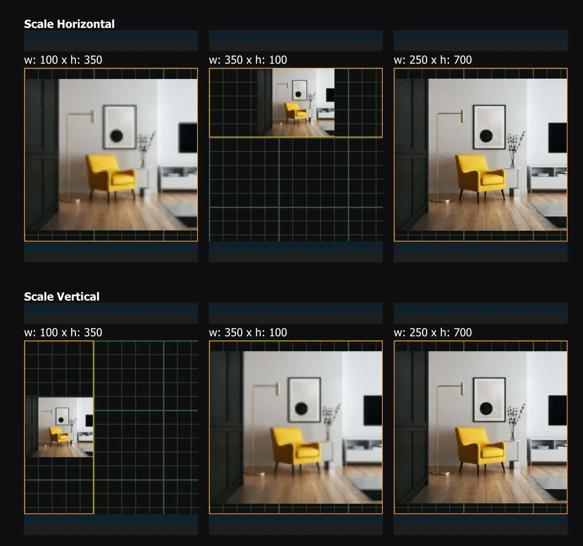
Responsive Image Scaling
Strategy #4
To avoid image distortion, use
max-widthto control horizontal scaling andmax-heightfor vertical scaling in combination with explicit image or container dimensions.
The intrinsic dimensions of an image serve as a starting point, but these can be adjusted using other CSS properties.
To display images that scale either horizontally or vertically, the max-width and max-height CSS properties are used to ensure the image scales down to fit its container if it's too large. You can also use width: 100% or height: 100% to scale based on the container, potentially causing distortion.
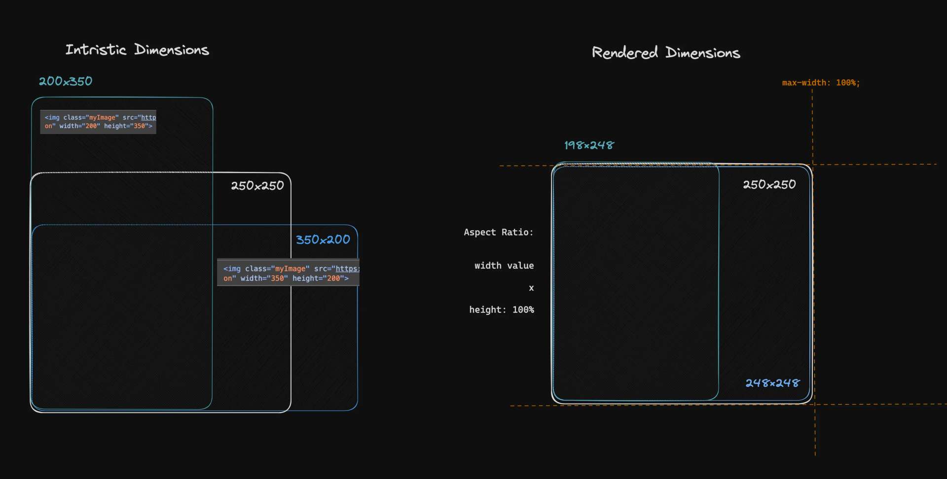
For scenarios where you want the image to scale down only if it's larger than the container's width (for horizontal scaling) or height (for vertical scaling), here's a solution that doesn't cause layout shift upon image loading:/* Horizontal aspect ratio control */
img {
max-width: 100%;
height: 100%;
object-fit: contain; /* scale-down, cover */
}
The image won't exceed the container's width, but it might leave empty space above or below the image if the container's aspect ratio is different from the image's.img {
/* Vertical aspect ratio control */
max-height: 100%;
width: 100%;
object-fit: contain; /* scale-down, cover */
}
The image won't exceed the container's height, but it might leave empty space on the left or right of the image if the container's aspect ratio is different from the image's.
Here's how it looks:
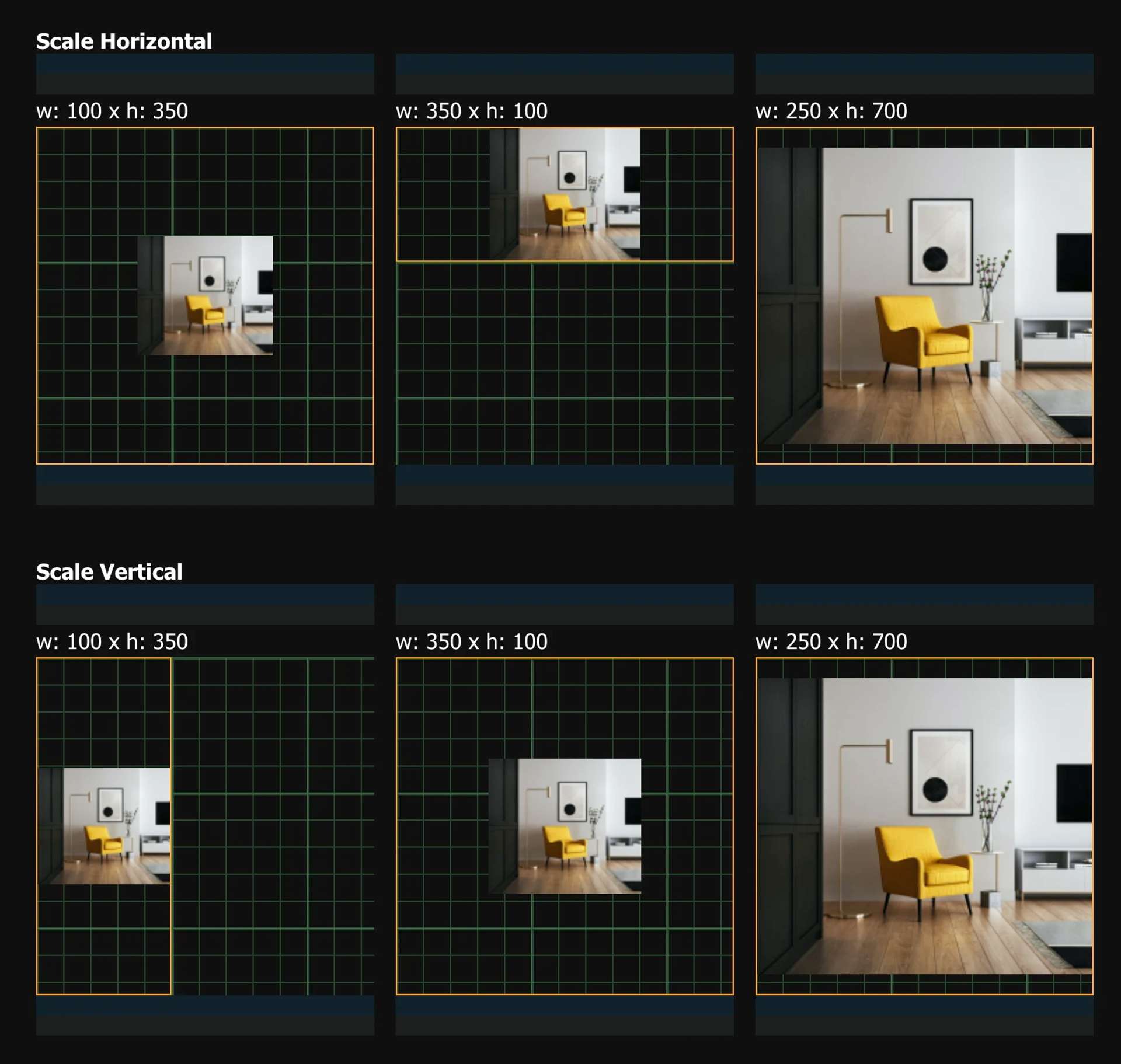
Imperative Scaling
Strategy #5
Apply
object-fit: scale-downto enforce the display of images in their original aspect ratio dimensions. This is particularly useful in scenarios where preserving the original image dimensions without cropping is a priority.
When dealing with images whose intrinsic dimensions significantly differ from their container's dimensions like our example above.
For scenarios where you want to imperatively display images without cropping or distortion, the object-fit CSS property becomes particularly useful.
In our example, the image's container is a 250x250 square, but in cases where the image's dimensions are vastly different (350x100), we can display image by their intrinsic dimensions imperatively using object-fit to ensure the original image dimensions will be preserved adjusting for height and width.
Consider this modification using object-fit: scale-down:img {
/* Vertical aspect ratio control */
max-height: 100%;
width: 100%;
object-fit: contain; /* scale-down, cover */
object-fit: scale-down; /* scale-down, cover */
}
Here's the result with images scaled down:
In practical terms, it's probably more effective to address this scenario using your media management solution.
IE Limitations with object-fit
The object-fit CSS property is widely supported in all modern browsers, including Chrome, Firefox, Safari, Edge, and Opera. However, it is not supported in Internet Explorer.
For completion, here's a workaround using absolute positioning and scaling:.container {
/* Set dimensions for the container */
width: 200px;
height: 150px;
position: relative;
}
.image {
position: absolute;
top: 0;
left: 0;
width: 100%;
height: 100%;
/* Scale down proportionally (adjust as needed) */
transform: scale(0.8); /* You might need to adjust the scale value */
}
This approach involves placing the image within the container using absolute positioning and then scaling it down proportionally using CSS transforms.
- This method can be more complex to set up and maintain compared to using
object-fit. - You might need to adjust the scaling factor based on the image and container dimensions to achieve the desired fit.
Image Scaling Reference
As a summary, let's look at some practical examples of how to display images. The following table provides a (non-exhaustive!) set of recipes for different scenarios:
| Width | Height | Max-Width | Max-Height | Object-Fit | Description |
|---|---|---|---|---|---|
100% | Auto | - | - | - | - Maintains aspect ratio - Fills width - Height adjusts dynamically |
Auto | 100% | - | - | - | - Maintains aspect ratio - Fills height - Width adjusts dynamically |
100% | 100% | - | - | contain | - Maintains aspect ratio - Scales to fit container - May show empty space |
100% | 100% | - | - | cover | - Maintains aspect ratio - Scales to cover container - May crop image |
100% | 100% | - | - | fill | - Fills container - May distort image |
Auto | Auto | 100% | 100% | - | - Maintains aspect ratio - Scales down if larger than max dimensions |
100% | 100% | 100% | 100% | contain | - Maintains aspect ratio - Scales to fit max dimensions - May show empty space |
100% | 100% | 100% | 100% | cover | - Maintains aspect ratio - Scales to cover max dimensions - May crop image |
- Example 3: Fixed Height and Auto Width
- This approach ensures the image always maintains a certain height, with the width adjusting to keep the aspect ratio.
img {
height: 200px;
width: auto;
}- Example 4: Max Height and Auto Width
- This method ensures the image never exceeds a certain height, with the width adjusting to maintain the aspect ratio.
img {
max-height: 200px;
width: auto;
}- Example 5: Fixed Width and Height
- This approach forces the image to always be a certain width and height. This can distort the image if it's not the same aspect ratio.
img {
width: 300px;
height: 200px;
}- Example 6: Object Fit
- This property specifies how an
<img>or<video>should be resized to fit its container.
- This property specifies how an
img {
width: 300px;
height: 200px;
object-fit: contain; /* or contain, fill, none, scale-down */
}Remember, it's important to consider the aspect ratio of your images when deciding how to size them. If you don't maintain the aspect ratio, your images can end up distorted.